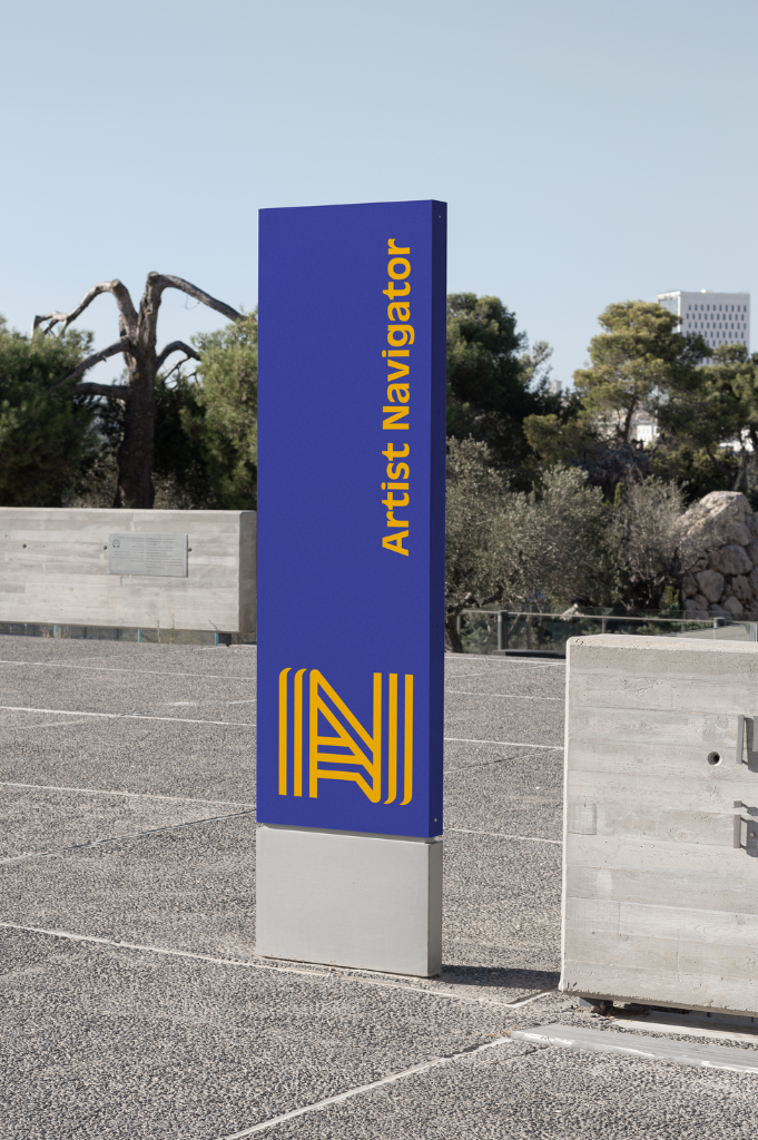
Artist Navigator
The Bridge For Baltimore Artist
Client
Baltimore Corps
Year
2022
Services
Visualizing an Unprecedented Civic Bridge When program leaders Kate and Terrell approached CRE8T1V3, the Artist Navigator—a brand-new initiative under Baltimore Corps—was pure innovation. They were tasked with launching the city's first-ever dedicated navigation system and centralized resource database for grassroots creators.
The Challenge
: Visualizing an Unprecedented Civic Bridge
When program leaders Kate and Terrell approached CRE8T1V3, the Artist Navigator—a brand-new initiative under Baltimore Corps—was pure innovation. They were tasked with launching the city's first-ever dedicated navigation system and centralized resource database for grassroots creators. Their mission was to serve as a vital bridge connecting local independent artists with institutional partners, professional pipelines, and peer-to-peer mentorship.
Because a platform of this scale had never existed in the city, the challenge was clear: CRE8T1V3 needed to build a visual identity from scratch that translated deep structural research into a trustworthy, community-first ecosystem that local artists would actually embrace.
The Design Concept: Retro-Futuristic Navigation
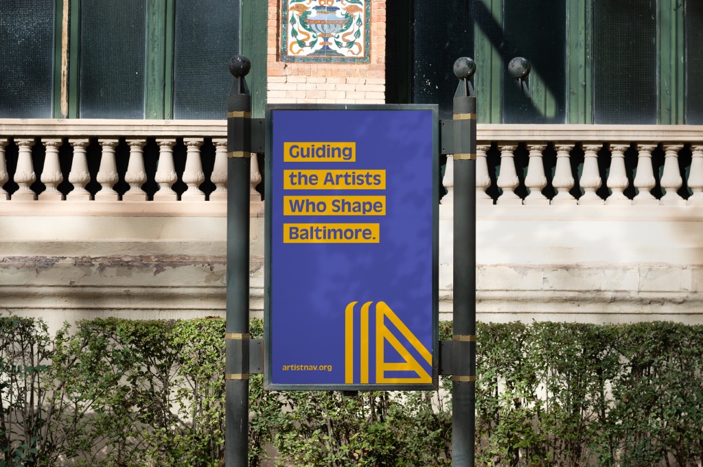
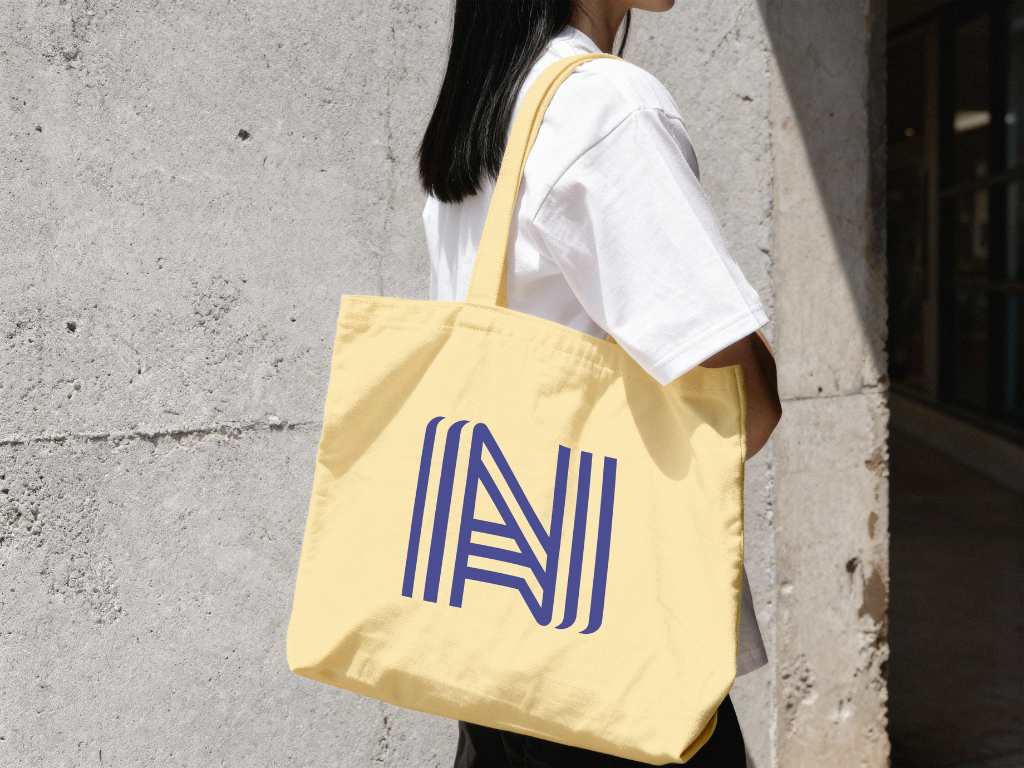
Inspired by the legendary, line-based environmental graphics of Lance Wyman, CRE8T1V3 designed a custom monogram that seamlessly weaves the letters A and N together. The intersecting triple-line weight instantly evokes the concept of roads, mapping, and structural navigation. The result is a bulletproof mark that feels simultaneously retro and forward-looking—perfect for an initiative mapping out the future of a creative economy.
Typography & Color Evolution
The Typeface: Antique Olive was selected for its distinct personality. Its soft yet bold weights bring a creative, elegant vibe to the system that perfectly balances the sharp, geometric precision of the A/N logo mark.
The Identity Shift: The brand was originally delivered in a stark black and yellow to anchor it directly within Baltimore City's civic identity. For this case study presentation, CRE8T1V3 evolved the palette—introducing a deep cobalt blue and an editorial cream base. This shift expands the platform from literal road signage into a premium, fine-art-inspired landscape that speaks directly to creators.
Photography & Graphic Style: Designing the City's Narrative
The visual system intentionally spotlights the human heartbeat of the program through a deeply rooted, intentional graphic language.
The Signature Collage Style: The art direction utilizes clean image selects styled into dynamic collaging against solid backgrounds. Having previously designed the official cover art for D. Watkins' Black Boy Smile (utilizing Devin Allen's iconic photography) and Kondwani Fidel's The Mud Was Made For Us, CRE8T1V3 brought this exact signature Baltimore aesthetic directly into the Artist Navigator system.
The Sepia Tone Shift: While high-contrast black-and-white photography is heavily popularized across the city, CRE8T1V3 introduced a rich sepia-tone overlay. This establishes a warm, historical, and archival aesthetic that feels celebratory and distinct to the platform.
Geometric Integration: The system's graphic assets are pulled directly from the structural anatomy of the primary logo. The intersecting parallel lines dynamically extend to form physical environmental elements—like public benches—while the geometric frames mimic the distinct silhouette of the Baltimore skyline.
An Enduring Legacy
While the Artist Navigator program has unfortunately since closed its doors, the visual ecosystem created by CRE8T1V3 remains a definitive blueprint for community-driven design. It stands as a testament to what happens when civic utility meets premium, culturally relevant art direction.
The Bottom Line: Design with a Pulse
At CRE8T1V3, we don't just build visual systems; we create from the heart. The Artist Navigator identity proves that high-level, responsive design can coexist with deep cultural authenticity. By pulling from real history, rich storytelling, and immediate community context, we engineered a visual ecosystem that didn't just display information—it resonated, connected, and inspired the creators who push the city forward.